The last few years have shifted what people think is “beautiful” for a baptism or christening cake. It’s less about squeezing every symbol on the planet onto one tier, and more about design that feels calm, intentional, and personal.
So yeah. Let’s talk about modern christening cakes and what actually changed in the last 5 years. Because it did.
The big shift: from traditional, busy, and literal… to clean, soft, and styled
A few years ago, christening cakes leaned heavily on obvious themes.
Cross. Rosary beads. Baby booties. Bibs. Giant “God Bless” plaques. Sometimes all of them at once. And lots of piping. Like, a lot.
Now, modern christening cakes tend to be more minimal. Not plain. Just edited.
You still see religious symbols, of course. But they’re smaller, subtler. A tiny cross on the front. A wafer paper dove. A little “baptised” script on top. It’s more design-forward, less checklist.
And honestly, that shift mirrors everything else going on in event styling. Christenings started borrowing from weddings and baby showers. Neutral palettes. curated decor. modern typography. soft textures.
Color palettes got way quieter (and way more interesting)
Five years ago, the default was pretty predictable:
- White with pale pink for girls
- White with pale blue for boys
- Gold accents if someone wanted it “special”
That still exists, but modern christening cakes have expanded the palette in a big way, while somehow also getting calmer.
Now you see:
- Warm neutrals like ivory, sand, oat, taupe
- Soft sage, dusty blue, muted lilac
- Cream with champagne gold instead of bright metallic
- Monochrome whites, but layered with texture so it doesn’t look flat
There’s also more confidence around gender-neutral designs. A lot of families want something timeless, not “blue vs pink.” Which makes sense. The cake ends up looking more elevated too.
Lamb cakes evolved. They didn’t disappear, they just… grew up
The lamb is basically christening cake royalty. It’s not going anywhere.
But the lamb topper designs used to be very cutesy, almost cartoon. Big eyes, big smile, sitting on a fondant hill with a banner. Again. Not wrong, just a specific era.
In the last 5 years, lamb toppers on modern christening cakes got more refined:
- Small lamb figurines with smoother detailing
- Lamb silhouettes or embossed lamb outlines
- Lambs made from wafer paper or hand-painted onto fondant
- A little lamb tucked into florals instead of being the whole theme
So it’s still traditional. But it feels more like design, less like a character.
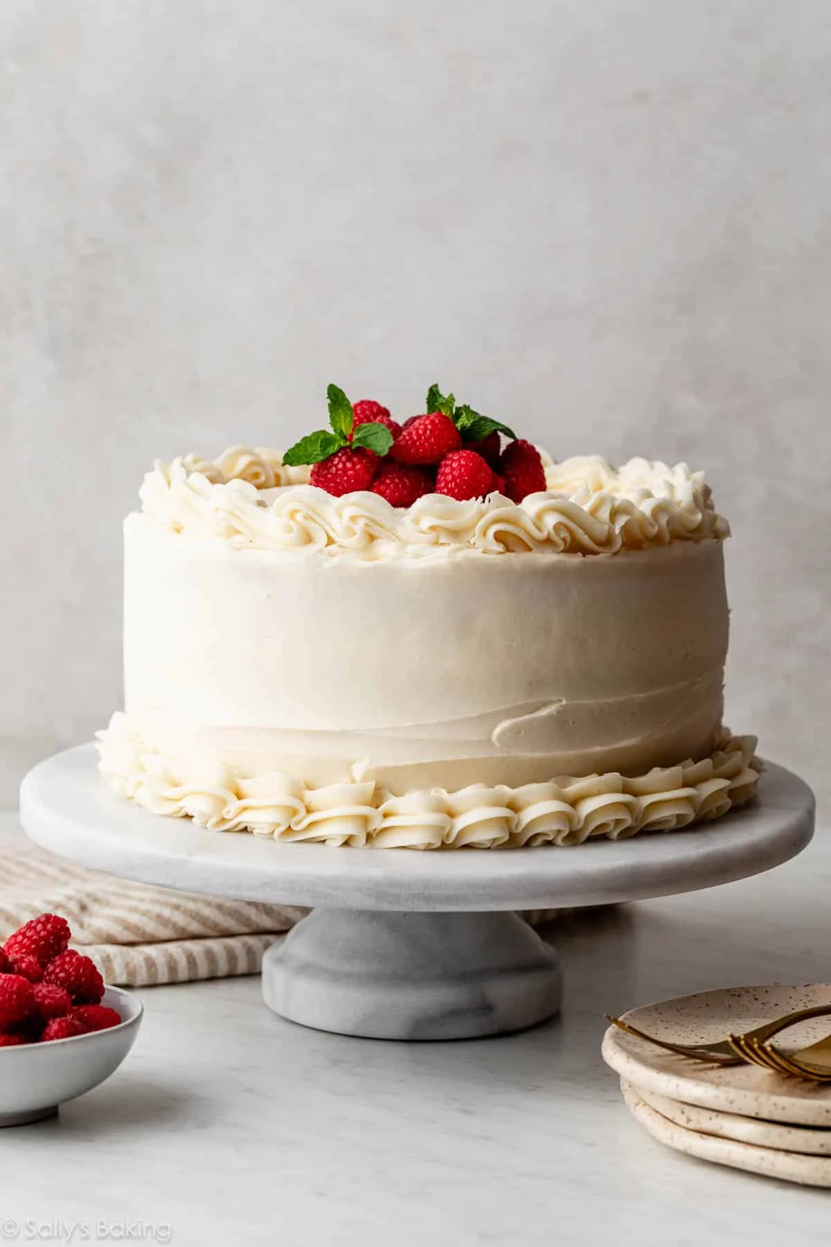
Wafer paper and rice paper changed everything (seriously)
This might be the biggest “quiet” revolution.
Wafer paper flowers used to show up mostly on wedding cakes, but now they’re everywhere for christenings because they give this soft, angelic look without feeling heavy. They also photograph beautifully.
So now modern christening cakes often feature:
- Wafer paper sails (those ruffled, wave-like sheets)
- Rice paper wraps around a tier for texture
- Wafer paper florals in white on white
- Light, feathery dove shapes, sometimes semi-translucent
It’s airy. It’s modern. It makes the cake look expensive even when the design is simple.
The rise of “single statement” designs
This is one of those changes you notice once someone points it out.
Older cakes tried to include multiple focal points. A topper, a plaque, piped borders, side decorations, maybe even a little fondant bible. A lot happening.
But modern christening cakes tend to commit to one main idea and let it breathe. For example:
- One large sugar bow, and nothing else
- One cross detail, done in a gorgeous texture
- One cluster of florals on a clean base
- One name in modern script, centered, no extra clutter
It’s sort of like. The cake isn’t begging for attention. It already has it.
Bows became a whole thing again (but not like the old fondant bows)
Bows are back, but in a different way than the chunky fondant loops from years ago.
Now you see:
- Wafer paper bows, light and slightly frayed at the edges
- Fabric-effect bows made from edible paper
- Bow “tails” draping down the tier
- Tiny bow repeats as a subtle pattern
A lot of modern christening cakes use bows to communicate “baby” without going full teddy bear. It’s sweet but still classy.
Florals changed. Less “bouquet on top,” more sculptural placement
Fresh flowers used to be stacked on top like a crown. Now the placement is more intentional.
Designers treat florals like composition. A corner cluster. A diagonal sweep. A little asymmetry. Even when it’s traditional, it’s arranged in a modern way.
And the flower choices changed too. You see fewer bright mixed bouquets, more:
- White roses, lisianthus, orchids
- Baby’s breath, but used sparingly
- Dried touches like pampas (very light, very neutral)
- Edible pressed flowers on buttercream
On modern christening cakes, flowers are less about “pretty” and more about shape and texture.
Buttercream got trendier than fondant (and people stopped apologizing for it)
A few years ago, fondant was still the default for “special occasion” cakes because it looked smooth and formal.
But now, buttercream is having its main character moment. People love it because it feels more handmade and more delicious. Also, modern decorating techniques make buttercream look intentionally styled, not messy. For more buttercream decorating ideas, explore expert techniques and creative cake inspiration.
So you see:
- Smooth buttercream with sharp edges (almost fondant-like)
- Textured buttercream, like stucco or plaster
- Palette knife florals
- Soft ombré fades that look like watercolor
A lot of modern christening cakes are buttercream-first, with fondant only used for small accents like a name plaque or a cross.
Acrylic and modern toppers replaced chunky plastic picks
Topper styles really reveal an era.
Those bright plastic “My Christening” picks with glitter and a big cross used to be everywhere. Now people want toppers that match the aesthetic of the cake.
So modern christening cakes often feature:
- Acrylic name toppers in white, gold, or clear
- Wooden toppers with engraved script
- Minimal cross outlines in metal or acrylic
- Tiny dove toppers that look like line art
It’s still celebratory. Just less party store, more keepsake.
Personalization got subtler (and more meaningful)
This one matters. People still want personalization, but it’s not always “HERE IS THE BABY’S FULL NAME IN GIANT LETTERS.”
Now you’ll see:
- First name only, in a soft script
- The christening date hidden on the back or side
- A short phrase like “Blessed” or “On your baptism”
- A nod to the family’s culture, but woven into the design
The personalization on modern christening cakes is more like a detail you notice up close. Which is kind of the point. It feels intimate.
Themes became more “aesthetic” than literal
Instead of literal themes like “Noah’s Ark cake” or “church cake,” a lot of families now choose design vibes:
- “Soft angels” (white, feathers, gentle gold)
- “Garden christening” (florals, greenery, natural textures)
- “Modern classic” (white on white, cross detail, clean lines)
- “Vintage baby” (lace textures, pearls, tiny bow)
So modern christening cakes are less like a themed birthday cake and more like an extension of the event styling.
Tier shapes and structure got simpler, but more architectural
There’s been more interest in structure, not just decoration.
So you’ll see:
- Tall single tiers (extra height, minimal decor)
- Two-tier cakes with lots of negative space
- Very clean cylinders instead of rounded edges
- Occasional vintage lambeth piping, but done in a restrained way
This is where modern christening cakes start to feel almost like wedding cakes, just softer and more innocent.
The “vintage” comeback: Lambeth piping and pearls, but updated
Yes, the vintage cake trend hit christenings too.
Lambeth piping, pearls, scallops, ruffles. It’s back. But it’s usually done in white or ivory, maybe with the tiniest hint of gold.
On modern christening cakes, vintage piping is often paired with something contemporary, like:
- A modern script topper
- A clean cross motif
- A minimal color palette
- A single bow detail
So it doesn’t look like a throwback. It looks intentional.
What people want now (in plain language)
If I had to sum it up, the last 5 years pushed christening cake design toward three things:
- Taste and texture matter more. Buttercream. Lightness. Edible details.
- The cake needs to photograph well. Clean lines, calm colors, good composition.
- It should feel personal, not generic. Even if the design is simple.
And that’s why modern christening cakes feel so different. They aren’t trying to prove anything. They’re trying to feel right for the day.
Final thoughts
Trends will keep changing, obviously. Next year it might be all about something new, maybe more color again, maybe more playful elements, who knows.
But right now, the best modern christening cakes are the ones that look soft and intentional. A little sacred. A little styled. Not overdone.
And if you are planning one, the easiest way to get it right is simple. Pick one strong design idea, commit to a calm palette, and let the details do the work. That’s basically the whole modern approach.
More about Fortnite Cake Designs Kids Are Actually Asking For in 2025